100 Years
100 Stories
A look at how Bharat’s logo has evolved over the years.
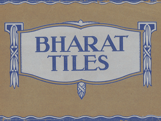
First product catalogue 1920s:
Bharat’s first product catalogue contained beautiful patterned tile designs which were offered to customers to flip through and select. This kind of Serifed font was common in the era when the concept of brand identity as a separate practice did not feature on the top of company agendas. Logos were often typeset by different printers and the font that was popular at that given point in time would have been used.
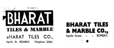
Newspaper Advertisements 1930-40s:
The company started placing advertisements in newspapers like the Times of India proudly displaying prestigious projects attained by the company in Bombay and elsewhere. This Bauhaus design was cutting edge typography for the mid 20th century.
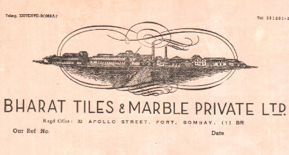
Letterhead 1960s:
This font selection consisting in a letter communicating the qualities of the Stilan tile, contains a design with slender strokes and the low waisted A, R and Es indicates an Art Deco style of lettering, which featured in nameplates, and signboards of the 1920s and 1930s. Although a little late for the time it blends beautifully with the composition of a letterhead.
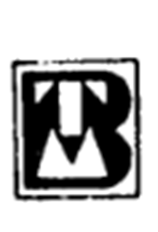
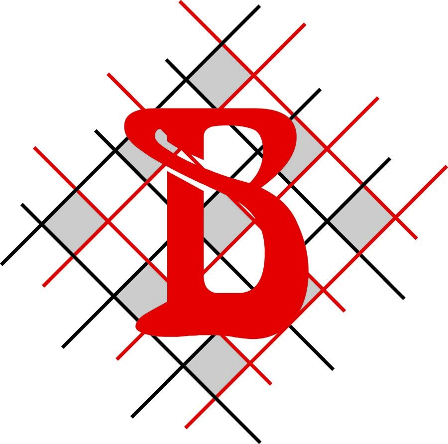
The company portrays its image as a leading tile maker with its logo, fitting the letters B,T and M into a square tile, with the letters themselves as stencil-forms.
BFT brought out the new logo with the mesh design as a background indicative of the grid- like stacking of tiles in the factory. The letter B in the Art Nouveau font was popular at the time as the company used emerging print technology to superimpose the letter on the mesh pattern.
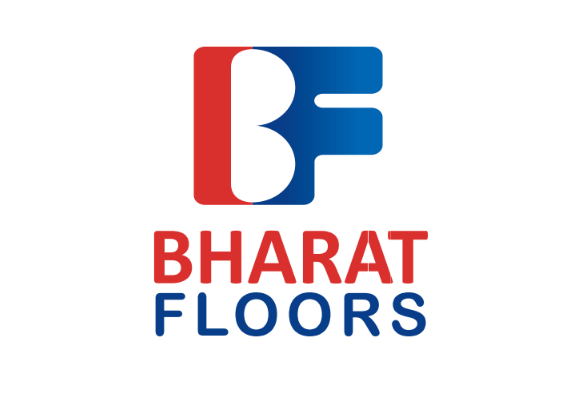
In this logo the merging of letters was digitally done with the colours red and blue chosen as brand colours.
You may also like
-
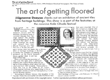 45Kala Ghoda Festival and RevivalFrom locating the original moulds to experimenting and producing tiles for display at the first Kala Ghoda Festival - Take a look at the impact the exhibition had on the company, revitalizing their heritage-range of tiles and giving Bharat a fresh leash of life.Read More
 -
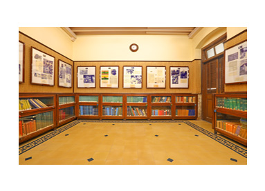 46Challenge of RestorationWith Bharat’s brand revival came a flurry of restoration jobs in a heritage sector that had been waiting for expertise in production and execution. Read about how Bharat dealt with the challenges that came with restoring heritage buildings and played a critical role in restoring floors of famous heritage sites across India.Read More
 -
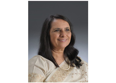 47People Behind Bharat: DSVWhen factories were shutting shop by the dozen, Dilnavaz Variava stuck her neck out and kept BFT afloat through the company’s most unstable phase. Delve into the personal story of the chairperson of Bharat and the effort she undertook to keep her legacy relevant.Read More