100 Years
100 Stories

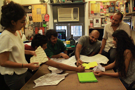
By 2015, the Indian market had changed in many ways. The influx of interior design magazines, home improvement reality television, instagram and pinterest broadened peoples’ understanding of design and how it can be harnessed. The Indian consumer had become more assertive and aspired to inhabit spaces that reflected their unique journeys and preferences. Minimalistic decor, clean and uncluttered looks became commonplace. It was time to tap into the currents of fresh design. And BFT chose to do this by collaborating with designers it had already worked with in the past. It was a win-win for all: as Shafali Diwanji, one of the designers the company collaborated with succinctly puts it, “You give a designer that freedom of unleashing their intrinsic nature, you are going to get a pot of gold.” While for the company it was an opportunity to infuse fresh ideas, designers on their part were keen to explore materiality and scale. Shafali adds, “ I wanted my design to go into realms that I could not take it into. In terms of marketing, in terms of production knowledge, technique and finish.”
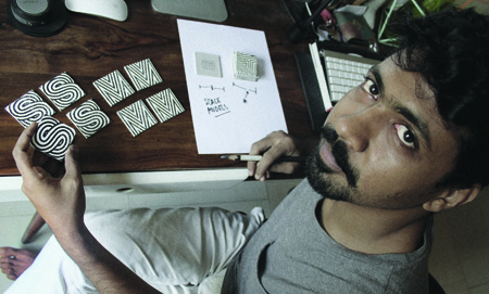
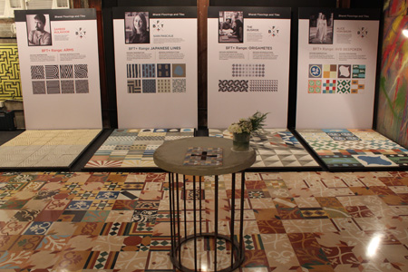
BFT+ is a range of tiles made in collaboration with some of the best design talent across the country. Ayaz Basrai, Tania Singh Khosla, Sian Pascale and Sameer Kulavoor, Shonali Mahajan, Alice Von Baum contributed their designs to the range. The tiles are modern in sensibilities, with a fresh play on lines and colours. Ayaz Basrai, who designed the Origametes range outlines one of the main motivators behind the BFT+ range. He says, “In the slew of new products, Bharat Floorings has moved beyond nostalgia. There is a heavy play on design. There is a serious design intent in every flooring.”
Ayaz wanted to create a tile that was scalable. “Apart from the Unitinta range, the BFT patterns were characterised by their boldness. I felt it was a limitation as one could not use them on a wider canvas where the overall impact could be overpowering. While this works very well in a few cases, as an alternative we wanted a tile that could code relationships over a larger span.” Ayaz’s instincts were confirmed by CEO Fayaz Mukhtiar, who pointed out that most of Bharat’s orders were for small areas - between 100 sq ft. to 200 sq ft. The critical question that then arose was, ‘How do you get a 1000 sq ft order?’ Ayaz’s Origametes took inspiration from Origami, the Japanese art of paper folding and he likens his designs to the infinite fold which “is soothing and calming even on larger scales.”
Designers have delved into their inner worlds and searched through the outer world to seek inspiration and manifest it in the form of a tile. Both Tania Singh and Sian Pascale, for instance, created designs that were deeply rooted in their own journeys. Tania Singh Khosla, designer of the immensely popular DashDashDot range admits, “I have a thing for dots. It can be interpreted in so many ways and it is so wholesome.” Tania’s introduction to design happened through a dot when her Fine Arts teacher asked students to create loneliness and noise using the form. It taught her that so many versatile things could be created with simple forms and in the DashDashDot series she uses the diagonal and the dot allowing them to interact with each other endlessly.
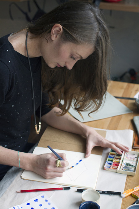
When Firdaus approached Sian Pascale, she was dabbling in ceramics, pursuing Yoga and reading ‘In Praise of Shadows’ a book on Japanese design in a library in Australia. “This book captivated me, and as a ceramic artist at the time, I began to experiment with the idea of a really simple aesthetic and working with only lines.” One afternoon in her studio, Sian set up a meditative space, laid out the artist paper and grabbed her watercolour paints. In one and a half hours the tranquil imagery of the Japanese Lines series was born.
In retrospect, one realises that BFT+ was one of the first instances where the brand and Firdaus exhibited an appetite for design risks. The products created by Sameer Kullavoor, Alice Von Baum and Shafali Diwanji each pushed the envelope and introduced in our midst flooring concepts one hadn’t imagined before. Alphabets from the English language on the floor, anyone? Sameer Kullavoor certainly thought so. In his quest to develop a product that was personal but not too literal, Sameer Kullavoor arrived on letterforms as a design base. Sameer drew inspiration from Mumbai’s Art Deco architecture and the typography that it represented, incorporating concentric forms into the design resulting in the A, R, M & S range that work as type if used singularly, but create unbroken patterns if used in different combinations. Alice Von Baum used her surroundings as an inspiration and designed clusters of tiles comprising a central design, borders and plain colours, giving the client the opportunity to choose their unique combinations. The AVB Bespoke with its little ‘Daisy’, inspired from an old tile fragment in a derelict building in Colaba or the completely unexpected and impish ‘Rabbit’ tile are wonderfully eclectic to say the least. Then there is the curiously titled “Extra Large Please’ by Shafali Diwanji that aims to elevate small spaces with big, monolithic patterns. Shafali “was trying to say extra large is cool” and Firdaus was curious enough to explore where this could take the brand.
For the designers it's a joy to see their designs taking on a life of their own. Ayaz says, “We came up with 2 colour stories. One was earth inspired and one was sky inspired. But what's happened to that range is that people have customised it and made it their own. Which is lovely. You can see that someone has a completely different perspective on it.” Sian adds, “You start with something, and then someone else brings in their creativity and turns it into something that you could never have created. It's as if you're collaborating with someone without even realising it.”
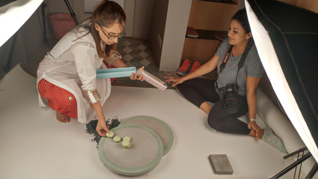
Firdaus admits it was a race to the finish line, taking the better half of 6 months. The designs were numerous and cranking out stencils was a difficult task at a time when the company had not made fresh stencils for years. He recalls, “Back then we had only 20-30 designs. Getting each stencil made was crazy. ”
But the exercise had the intended effect. And then some. The collaborations with some of India’s top designers grabbed eyeballs. Interior and design magazines noted the emergence of a new player onto the bespoke interiors scene. But for Firdaus, it changed the way tiles were being purchased from the company. Earlier plain tiles were the norm and patterned tiles only used on small patches or borders. The trend was turned upside down. With the new range of tiles, designers and homeowners became more daring, choosing to use graphic, patterned tiles on the entirety of the surface.
But more than anything Firdaus has created his own legacy. The old Bharat produced enduring Heritage™ cement tiles but was slow on design innovation; on the other hand the new BFT had just discovered that it could steer a new era where design took centre stage. Firdaus says, with some pride “The trend we have created is enduring. Before us there wasn't any trend of collaborations. People have come up to me and said we are the original collaborators.”
You may also like
-
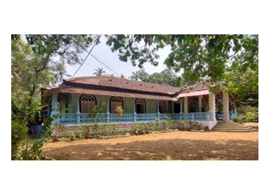 63My Home Alinto CoelhoStep into the timeless charm of an Old Goan house, where Bharat tiles hold the memories of generations. Discover the rich history of these iconic tiles and how they've become an integral part of this heritage home's story, all with a touch of nostalgiaRead More
 -
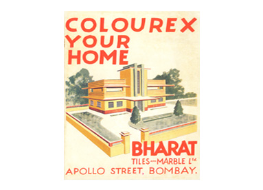 64Archival Find: Colourex CatalogueA vibrant, witty booklet merchandising coloured cement plaster from the 1930s. Here you can read more about the product that shaped many a Bombay Deco facade.Read More
 -
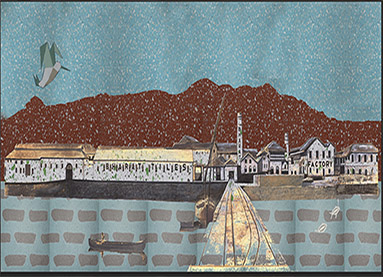 04"The Country's largest and most efficient power factory"The site of hundreds of creative experiments, installed with the top of the line equipment imported from faraway Europe. Bharat's Uran factory was where it all began.Read More

